At its fifth annual Developer Conference held in San Francisco in the first week of November, Samsung unveiled a complete UI overhaul for its smartphones. Dubbed as One UI, the new Android skin from Samsung will be replacing its outgoing Experience UI. We have installed the beta version of One UI on our Galaxy Note 9 and our initial impression has been nothing but positive. The new skin is bringing a lot of positive changes over Experience UI and makes the software feel fresher and lighter. So, if you are debating whether Samsung’s new UI will be good for you or not, here are the 13 cool One UI features that will help you understand what this new Android skin has to offer you:
Best One UI Features
1. Improved One-Handed Usability
With One UI, Samsung is hoping to tackle the biggest problem that is associated with the ever-increasing smartphone sizes, the one-handed usability of the phone. The new UI introduces a fresh look which makes the phone really easy to interact with using only one hand. Basically, the new UI brings a large viewing area at the top and an interaction area on the bottom half. This has been implemented throughout the native apps. So now, users will be able to interact with the topmost controls with ease.
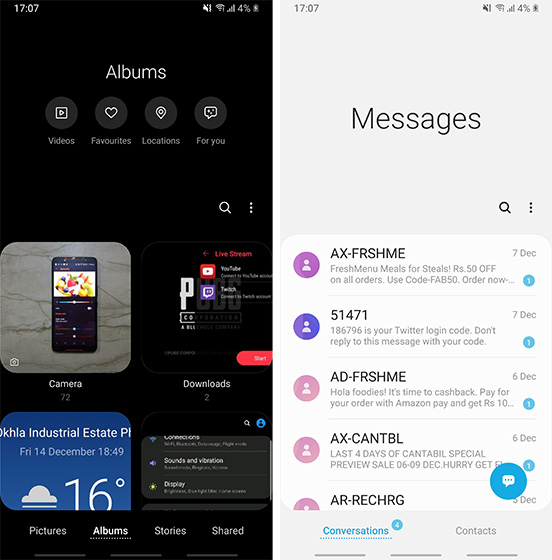
The best part is that the viewing area disappears once you scroll down the app which basically means that you are not losing any screen real-estate. I also love the fact that Samsung has shifted the interactive buttons from the top to the bottom, which makes it very easy to interact with them using just one hand. Overall, the new UI is very friendly for one-handed use and I love it.
2. Navigation Gestures
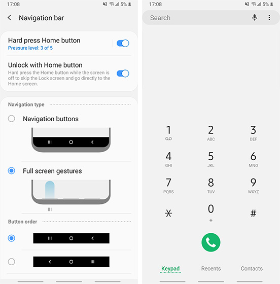
With One UI, Samsung is also releasing its own take on the gesture style navigation. Basically, users can opt to use the gesture navigation instead of the Android buttons. Once you enable the gesture navigation, you will be able to navigate your smartphone just using gestures. Samsung implementation of gestures is similar to the ones that we saw in phones from Oppo and Vivo. So, you will swipe up from the bottom left to go back, bottom middle to go home, and bottom right to open the recent apps menu. Similar to buttons, the gestures for going back and invoking recent apps menu are interchangeable.
3. Adoptable Storage
One of the biggest improvements coming with One UI is a feature called Adoptable Storage. The feature basically allows you to use a microSD card as extended phone memory. What this means is that the SD card won’t be treated as an additional memory rather it will be read as the internal memory of the phone. This will allow users to install apps and games on the SD card without any problem. This will be a huge improvement for SD card users. That said, the feature was not working during the beta and we will have to wait for future versions of the skin to see if it works properly or not. It’s still a pretty great feature and one we can’t wait to test out.
4. New Icons and Design Elements
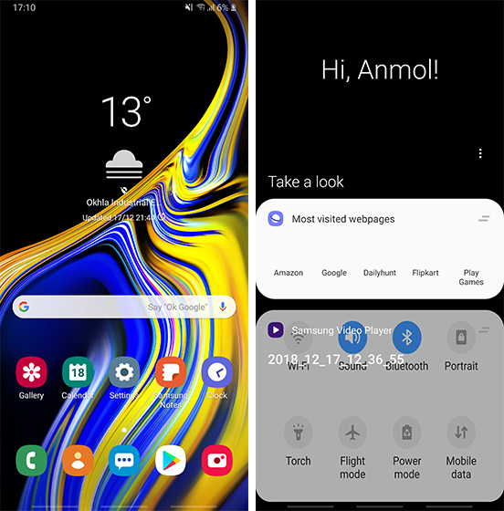
One UI is also bringing a huge overhaul to the overall looks of the UI. Firstly, there are new icons which are way flatter and normal. While the icons still possess a squircle shape and look a bit cartoonish, the new icons are way better than the previous Experience UI icons. It is also inspired by the hardware design of the company’s flagship smartphones which means you will see a lot of rounded edges all through the user interface. Most of the times these rounded edges look quite cool, however, there are some places where they seem a little overkill. One such place is the Bixby screen which I really don’t like. Apart from these small hiccups, I think Samsung has done a great job with design here.
5. Dark Mode
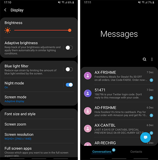
One UI is also introducing one of the most user-requested features which is a complete system-wide dark mode, and I love it. Since the dark mode is system-wide, every UI element along with all the native applications support it. This means you will get a dark notification panel, dark Settings app, dark app drawer, and so forth and so on. The dark mode looks gorgeous on our Note 9 thanks to its OLED edge-to-edge screen. Along with the fact that this looks good, it also makes up for really comfortable viewing, especially at night.
6. Recycle Bin in Gallery
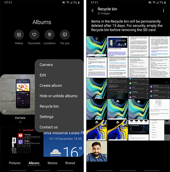
One of my favorite features of Google Photos is its trash functionality which keeps the deleted photos saved for a certain period of time. I have accidentally deleted many photos and if not for the Trash feature of Google Photos, I would have lost many important photos. With One UI, the same feature is coming to Samsung’s native Gallery app. The feature is called Recycle Bin and it basically saves all your deleted photos for 15 days before permanently deleting them. So, if you happen to delete a photo by mistake, you can easily reclaim it.
7. Lift to Wake
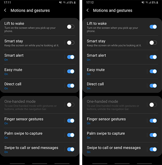
I am still not sure how Samsung took such a long time to introduce this nifty feature but finally it has. Dubbed as the “Lift to Wake” feature (commonly known as raise to wake on other devices), the feature automatically wakes up your screen when you lift to look at it. The feature is even more helpful if you use Samsung’s iris scanner as it allows the system to start scanning even before the screen was turned on, making things super fast.
8. Battery Optimization Settings
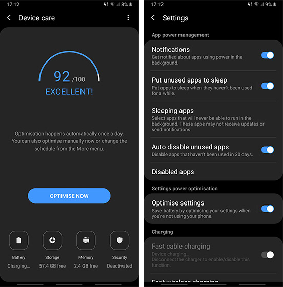
Samsung is introducing a new “Optimize Settings” option in One UI ‘s battery settings, which when enabled will automatically reset the brightness, screen timeout, and media volume at midnight to save battery. So, if you tend to keep everything turned on to the max during the day, it’s great to have all these settings automatically be reset to lower levels to save battery on your phone.
9. Smart Orientation
One UI is based on top of Android Pie, so there are many Android Pie features that are integrated right into the skin. One of my favorites is the smart orientation lock feature which gives you a small button at the bottom whenever you try to change the orientation while having the auto-rotate setting off. This makes it very easy to adjust the orientation without having to open the quick settings panel.
10. New Keyboard Features
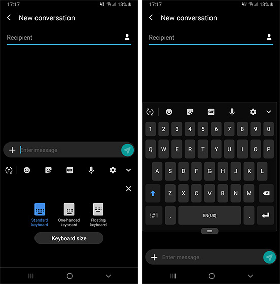
The Samsung keyboard is also getting some cool new features. First of all, there’s now a new “Floating mode” here in the modes page of the keyboard. As the name suggests, the floating mode makes your keyboard float allowing the user to move it anywhere on the screen. You can even adjust the size and the transparency of the keyboard in floating mode which is pretty cool. There’s also a new Adaptive Theme option, which automatically changes the theme of the keyboard to light or dark depending on the colors of the app you are on.
11. New Camera Features
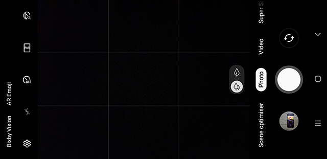
The camera app has gone through an overhaul as well. Depending on your preferences you might love or hate the new camera UI. I personally find it more user-friendly and hence love the new user interface. Apart from the new looks, the camera app brings support for HEIF file format. Plus, there’s also a setting which when turned on starts the camera on the last that mode you were using which is definitely really handy.
12. New Animations and Animation Control
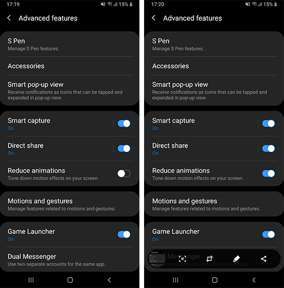
One UI also introduces new and refined animations throughout the user interface. The animations to close apps to go home, launch the multi-task menu, drop down the quick settings panel, etc feel more responsive and elegant. I especially love the new screenshot animation as it looks pretty sweet. If you don’t want to deal with animations, there’s also a built-in setting which reduces animations all over the UI. While it doesn’t totally remove the animations, it does tone them down.
13. New Clock Designs
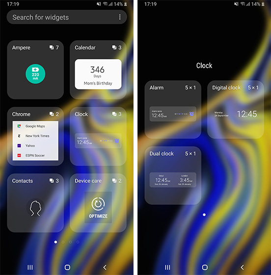
While this is not a big feature, I love the new clock designs so much that I had to include this on this list. As the title suggests, there are a number of new clock designs in One UI which are both informative and beautiful. I think most Samsung users will enjoy these new clock designs.
SEE ALSO: 22 New Android P Features You Should Know
The Features That Make One UI Worth Installing
That ends our list of the best One UI features that you should expect from the big release. Personally, I love the new UI and prefer it over the Experience UI that Samsung has been using so far. Do let us know your thoughts about it by writing in the comments section below.
from Beebom https://beebom.com/cool-one-ui-features/

No comments:
Post a Comment