Having been originally envisaged as a Internet Explorer replacement in Windows, Microsoft Edge has become a fairly popular web-browser on not only desktops, but also on mobile platforms with more than 10 million downloads on Android alone. The app has also gained a plethora of new features like the dark mode support, and ad blocking, since it was originally released on the platform, and the latest beta release (version 44.11.24.4109) now brings a new Control Center that simplifies the process of customising the browser by combining multiple settings options under one roof.
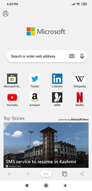
As noted by OnMSFT, the new UI is turned on by default in the latest beta for all users after being extensively soak-tested over the past few weeks. The first thing you’ll notice is the redesigned navigation bar (at the bottom) that now has the ‘Control Center’ button at the middle replacing the ‘Continue on PC‘ button, which has been banished from the panel altogether. Instead, there’s now a ‘Share’ button on the far right to fill up the vacant place.

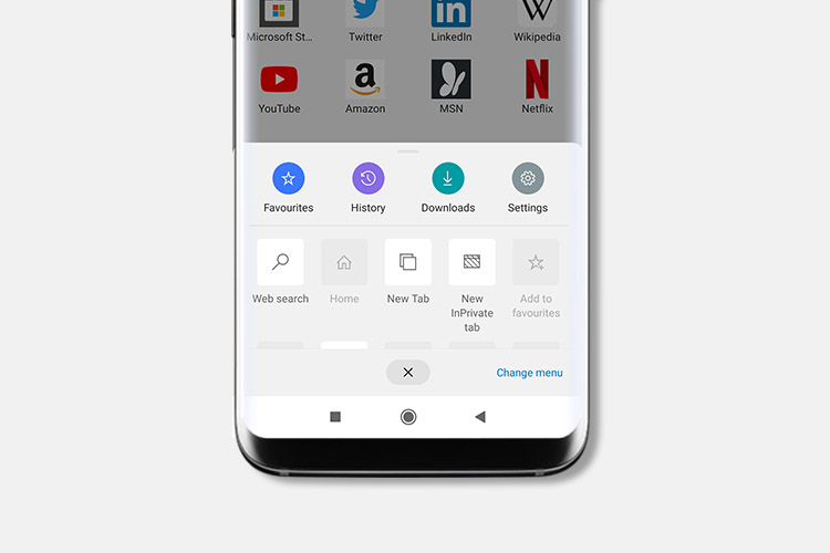
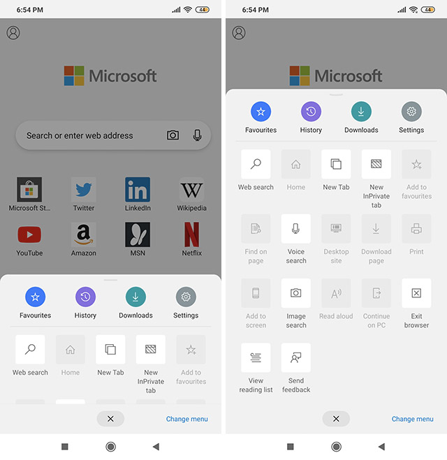
As for the new Control Center interface, it can be accessed by tapping on the ellipsis menu (…) at the center of the revamped navigation bar at the bottom. Tapping on that will bring up the new shortcut panel that can then be pulled up using gesture navigation much the same way as the Quick Settings panel needs to be pulled down from the top edge of the screen on Android devices.

What you’ll find is that you can drag and drop various shortcuts to create your own customized UI on the panel, so that the options you use the most can be placed on the top row(s) for easy access. While the original row including Favorites, History etc. cannot be customized, users will be able to add any number of other options in the subsequent rows.
In addition, there are a few relatively minor changes as well, including slightly rounded corners of the search box on the default home page, while the profile icon is now front and center on the top-left rather than being buried under a menu. While the changes seem relatively minor, they will likely make the browser more convenient for regular users.
from Beebom https://beebom.com/edge-beta-android-control-center-redesign/

No comments:
Post a Comment