Google is the one-stop-shop for all web services. From Gmail to Google Docs, the company offers all type of services, all for free. Do you ever wonder with all these services being free, how is Google earning revenue? Well, the simple answer to this: Advertisements. Google is fundamentally an ad-driven company, earning most of its revenue from ads of several websites and products.
Last year, Google tweaked its search engine for mobile browsers to add “Favicons” or preferred icons to the search results. These are small icons representing the logo of the sites that are being displayed in the search results.
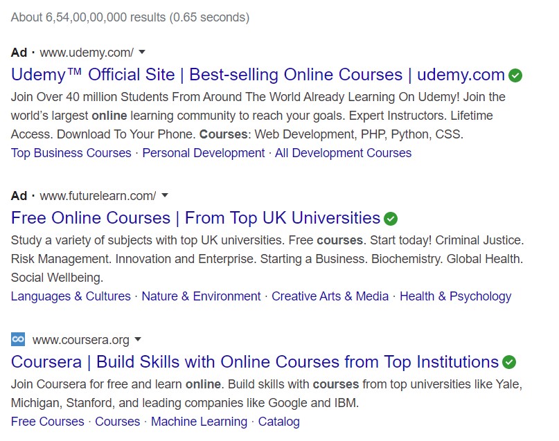
On January 13, Google started rolling out this feature for desktop users. Now if you search for something on Google, you can see the tiny logos of the websites at the left-hand side of the respective website names. Google says that this feature is the “part of a plan” that will enable users to understand where the information is coming from.
I don’t quite understand how is this going to make a difference for the users. People do not need to check tiny icons to differentiate between a reliable source from a fake one.
Whether this feature helps the users or not, it is surely helping Google to earn more revenue. Let me tell you how.
How Google Is Making People Click On Ads More
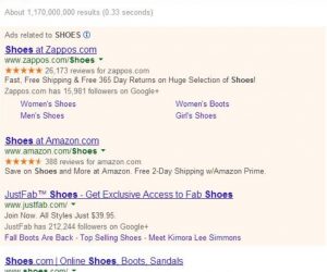
See, with the “Favicons” feature, Google smartly redesigned their way of showing ads in the search results. Previously, when we searched for something on Google, we could easily differentiate the ads from the actual organic search results. The ads were shown at the top of the page in a box with differentiating colours. This way we could identify which results were ads and which results were organic, without the need for a “Favicon”.
With this update, along with the tiny icons, Google is showing the ads with a black bold “Ad” icon. But there is no differentiating line or section which divide the organic search results from the ads.
This change already proved to be gainful for the tech giant. It is driving more people to click on ads instead of the actual search results. According to a digital marketing agency, the click-through rates of the ads have already increased for the desktop sites. When Google rolled out this update to the mobile platform last year, the click-through rates of some of its clients increased from 17% to 18%.
In a Twitter post last week, Google said that this format “will put the brand of a website on the front and center helping searchers better understand where the information is coming from and more easily scan the results”. On this post, many users showed their disapproval for this format, putting up comments like, “Revert this visual garbage” and “Everything looks like an Ad”.
Google has not responded to these criticisms as of now and we don’t know if they will revert this format or not. But what we do know is that Google is being a sly fox, poaching on users and making them click on more ads instead of actual search results and gaining more revenue than before.
What do you all think of this new format? Let us know down in the comments.
from Beebom https://beebom.com/google-making-you-click-on-ads/


No comments:
Post a Comment