Just recently, Microsoft released the preview build of Surface Duo in the form of an emulator to test and build apps. So we installed the emulator and took a detailed look at the software that is going to power Surface Duo. And now, the Redmond giant has released the preview build of Windows 10X that is going to ship with Surface Neo — a dual-screen device that acts both as a laptop and a tablet. In a way, Windows 10X is a huge development for Microsoft as it’s built using Windows Core OS (WCOS) — a common base for all future Windows OSes. So in this article, we take a comprehensive look at the visual aspects of Windows 10X and find out how different it’s from Windows 10 in terms of design language and user experience. So without further delay, let’s begin.
An Early Look at Windows 10X
If you are unaware of Windows 10X then I would highly recommend our explainer on Windows 10X features before we move ahead. In this article, we are especially taking a look at the visual aspects of Windows 10X. Although Windows 10X is running in an emulator, this is for the first time, we are able to interact and get a closer look at Windows 10X and Windows Core OS in general. So before anything, we will begin with the user interface as Microsoft has completely reimagined how a modern Windows OS will look like.
1. User Interface
Most of us would agree that Windows has not gone through any foundational change in user interface since Microsoft’s early days. From Windows XP to Windows 10, you have the same start menu, taskbar, system tray, file explorer, dialog box, etc. Microsoft did try to modernize its interface with the release of Windows 8 with its metro look and live tiles. However, it was not well received and Microsoft quickly went back to the start menu with Windows 8.1 and 10. As they say, there are some intrinsic features that define an operating system and the start menu is that key feature for Windows OS.
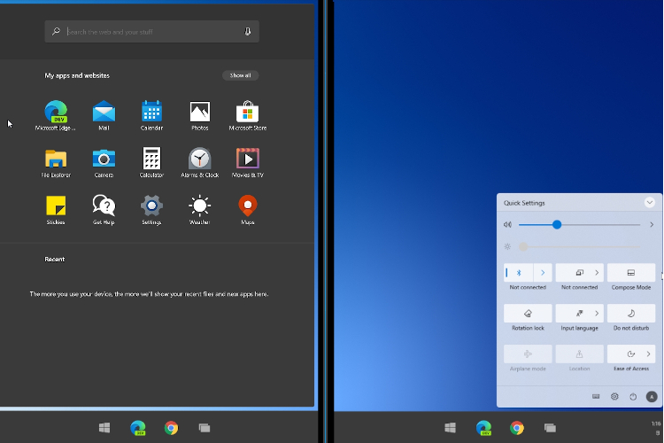
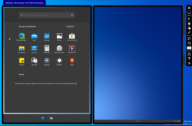
Fast forward to 2020 and you see a different Microsoft that not only talks about the user interface but also cares deeply about user experience. From the looks of Windows 10X, it seems the Redmond giant has made peace with its past and created something new from scratch. On Windows 10X, the quintessential start menu is gone and it’s replaced by a modern-looking and snappy launcher. The taskbar is centered and remains hidden to give you a full-screen user experience. The system tray is also gone and now it houses the Action Center. Simply put, Windows 10X has changed the very nature of Windows OS.
Having said that, Microsoft still gives you plenty of options to customize the taskbar and launcher. But every element is polished, unnecessary features have been removed and the UI seems overall light and snappy even though we are running Windows 10X in an emulator.
2. User Experience
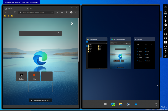
Now that we have talked about the user interface, let’s find out how Windows 10X makes the experience better than Windows 10. I will start with “Spanning” as it’s one of the headline features of Windows 10X. If you open an app on one side of the screen, the app will open on that particular side freeing the second screen for other tasks. This is an awesome feature for power users and multi-taskers. However, if you want to use the app in full-screen mode, you can simply drag the app window to the center, and it will span to the whole screen. Since I am using Windows 10X on an emulator, there is some delayed response while spanning, however, I believe it would be seamless while operating on an actual foldable device like Surface Neo.
Secondly, I want to talk about fluidity and animation. While navigating through Windows 10X, the UI feels pretty snappy and solid. Along the way, you would notice some animation effects too. For example, if you open an app from the taskbar, you would notice the ribbon effect and that looks cool. The transition between apps is also done smoothly making the UI feel mobile and light. Apart from that, you have gestures for launcher, taskbar, and moving apps from one window to another. Overall, Windows 10X gives a fleeting sense of a mobile operating system in a desktop environment and I think that is the way forward.
3. Action Center
Action Center has been completely redesigned on Windows 10X and looks far better than what we have on Windows 10. It’s a mini-window panel where you can turn on and off a bunch of controls without jumping to the Settings page. Just one click and you are done. Not to mention, the Action Center looks visually appealing in Microsoft’s Fluent Design language. Other than that, the Action Center also shows a notification box if you are playing any media on your computer. From there, you can change the track, stop the song or control the volume comfortably. And of course, you get all your notifications in a neat manner without any clutter in an accented UI.
4. Compose Mode
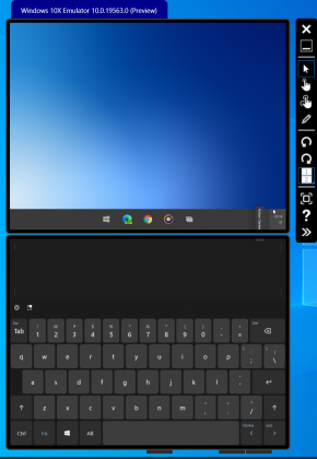
In the Windows Core OS article, I have explained CShell (Composable Shell) and what it entails. Basically, it’s a portable user-interface that can be changed based on the form factor on any WCOS-powered OS (like Windows 10X) in real-time. And finally, we find CShell in action on Windows 10X. From the Action Center, you can turn on Compose mode and easily switch to a laptop UI in real-time. You will move from tablet and touchscreen-friendly UI to a traditional laptop UI with the on-screen keyboard on the second screen. Furthermore, you can use Wonder Bar on the second screen — something like the Apple’s Touch Bar — to send GIFs and emoticons.
5. File Explorer
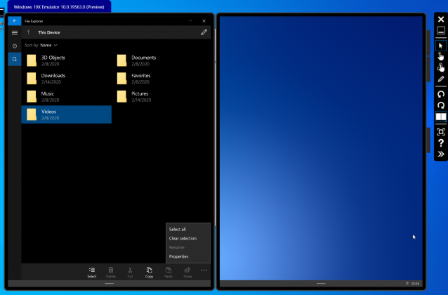
File Explorer is a topic of heated discussion among Windows users and almost everyone wants to have the classic File Explorer. Alas, you will have to forego the legacy file explorer and embrace the new UWP-based File Explorer on Windows 10X. If you want to move ahead, you have to somehow ditch the legacy apps. Anyway, from the outset, the File Explorer is not too bad in terms of UI and performance, but it’s definitely lacking many essential features. For example, there is no Quick Access or ListView and you can’t pin folders to the sidebar. But you don’t have to worry as Windows 10X has just entered into public development and many features can be added before the final release.
6. App Behavior
Now we come to applications which is another area of concern for Windows users who are all excited about the new developments, but equally confused about app support. As I have explained in my Windows 10X article, you can definitely use legacy apps like Microsoft Office and VLC, but it will run through a container. As a result, you might experience slightly slower performance and lower battery life. However, Microsoft has promised that there will be little to no difference in performance between UWP, Web, and containerized Win32 apps.
To test these claims, I installed IrfanView and Chrome and they worked fine without any issue. Do note that I am running Windows 10X in an emulator so the performance was not up to the mark, but the installation was a breeze. Basically, as a general user, all you have to know is that you can install and use almost all the apps on Windows 10X — the same way you do on Windows 10. Just that the mechanism behind running those apps will be different. Having said that, Web and UWP apps are the first-class apps on Windows 10X and they will give you the best performance and battery life.
7. No Antivirus and Registry
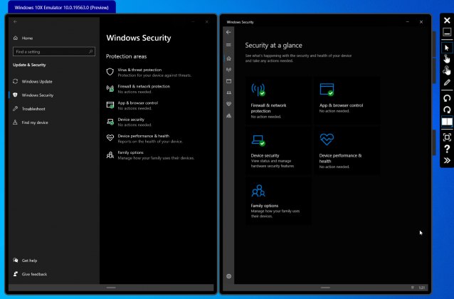
There is no native antivirus on Windows 10X like Windows Defender. The reason behind this decision is that every app will run in a sandboxed container, be it UWP or Win32 apps. UWP apps will run through a clear set of APIs and interact with the underlying OS. Whereas Win32 apps will run like a proxy program handled by a remote server connection. This will protect the OS from harmful programs and potential threats. Apart from that, since there is no legacy component available natively, there is no Registry or PowerShell tool. So on Windows 10X, no more fiddling with the core operating system.
Windows 10X: Are You Impressed by the Look So Far?
So that was our detailed look into visual aspects of Windows 10X and how it behaves with apps and the desktop environment. Of course, this is an early phase of development and many things will be added and removed before the final release. However, we are sure of one thing that Microsoft has done a brilliant job at bringing a light, visually-appealing, and modern OS. Now whenever Microsoft releases another build of Windows 10X, we will test it out and update the article so stay tuned with us. What do you think about Windows 10X? Is this what you have imagined a modern Windows OS will look like? Do let us know your opinion in the comment section below.
from Beebom https://beebom.com/windows-10x-early-look/




No comments:
Post a Comment