As we are approaching the month of June, Apple’s WWDC 2020 is getting closer one day at a time. Last year, Apple released iOS 13 and iPadOS 13 for iPhones and iPads with several new features and refinements. This year, its time for iOS 14.
Prior to the release, some designers and creators have produced videos showcasing their own ideas of how the next iOS should be. Similarly, concept creator and YouTuber Kamer Kaan Avdan, who makes concepts of latest OS versions, has produced a video showing how the next iOS should be designed by the tech giant.
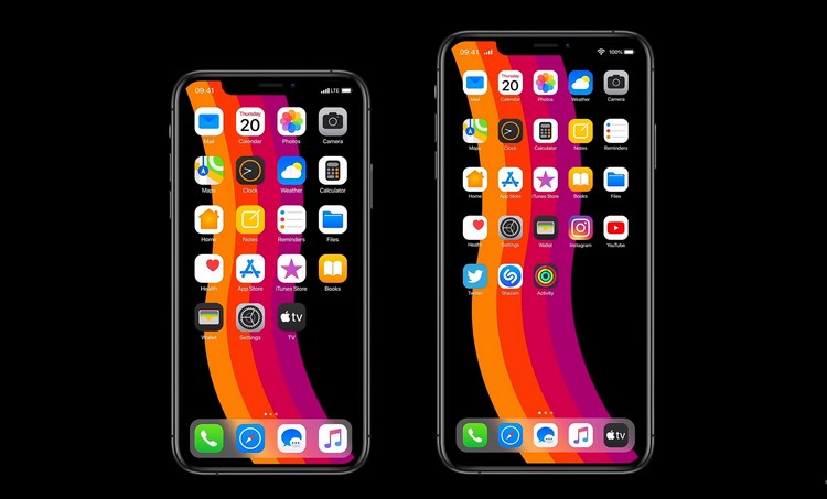
In the video (below), the iOS 14 concept takes many problems that are still present in the latest versions of the OS and refines. The video shows a redesigned home screen with a tighter grid-layout and some new icons for the system apps like the Photos, Mail, Safari and more.
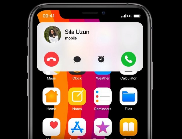
Now, a life-long concern for iOS users is that they cannot ignore an incoming call without letting the caller know. This happens as the incoming call hogs the whole screen of the device and users just get the options to receive, disconnect or set a reminder for the call. Similarly, when users invoke Siri, she takes up the whole screen to answer the queries. So, this concept shows how a simple design change can fix these two major problems. The designer showed how the call and the Siri interface can just take the upper part of the screen to show the details without hogging the full screen of the devices.

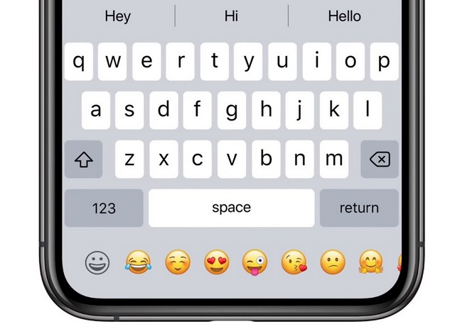
Apart from these ideas, the concept also shows a redesigned Settings app, in which users can pin their favourite actions to the top of the page. There are also refinements to Apple Music, making it more compact and intuitive. In fact, the concept also shows how users can set third-party apps as default apps. This can actually happen with iOS 14. Lastly, the iOS 14 concept shows a new keyboard that utilises the bottom part to show an emoji bar. This bottom part of the keyboard is currently blank and Apple could easily implement this design with iOS 14.

Last year, with iOS 13, Apple mainly focussed on bug fixes as iOS 12 was a bug-filled OS. However, now that iOS has become quite stable, Apple may focus on some new features with their upcoming iOS and iPadOS. We just have to wait and watch what the company delivers in this year’s WWDC.
from Beebom https://beebom.com/ios-14-concept-features/

No comments:
Post a Comment